PSG: what a stripe remembers.
Daniel Hechter’s design is a useful way into the club: colour, repetition and the memory carried by a shirt.
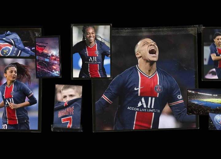
Before a football shirt has a name on its back, it has a composition. A dark field, a bright vertical band, a pair of thin edges: the eye reads a hierarchy before it reads a badge. That is where we begin with Paris Saint-Germain. The Hechter shirt is interesting as a graphic system, a design that can remain recognisable while the object carrying it changes.
The record
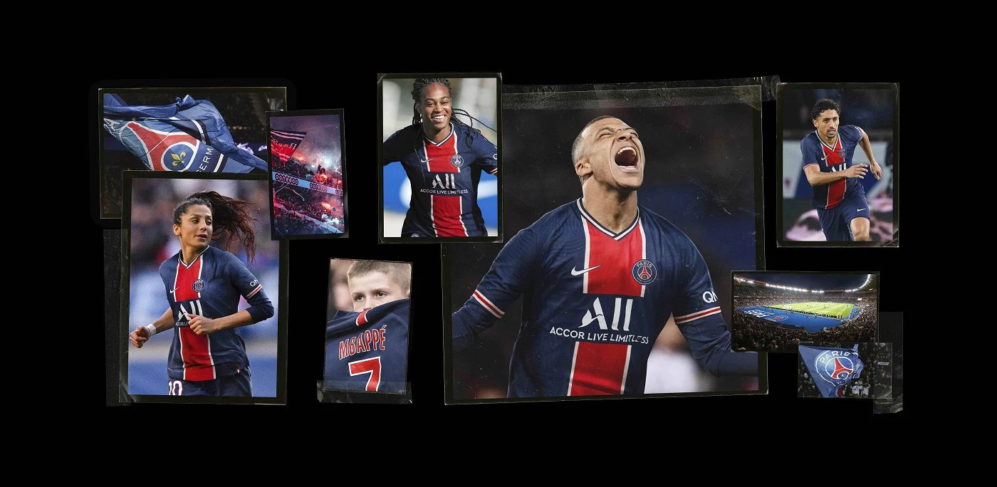
PSG’s account of its 2020 anniversary kits dates the first appearance of Daniel Hechter’s design to 1973. It credits the Parisian fashion designer, who became the club’s chairman, with the central red stripe. The 2020–21 home shirt returned to that design for the club’s fiftieth anniversary. These are the club’s documented dates; the visual reading below is ours.
A band that organises the body
In the anniversary campaign, the red centre holds its place even as the shirt moves between bodies and photographs. The narrow white separators keep the band distinct from the blue field. They give the composition a crisp boundary that remains readable beside a face, a badge or a sponsor. A small line can have a large job.
This is a useful distinction between colour and composition. Red and blue alone do not make the design. Their placement, relative widths and contrast matter. The actual garment adds interruptions: a crest, a manufacturer’s mark and lettering. The stripe gives those separate signs a shared visual ground without requiring them to become one image.
Repetition is a kind of archive
An anniversary kit can make an old visual arrangement newly visible. But recognition does not require every detail to stay fixed. A viewer can carry the memory of a pattern through changes in fabric, collar, sponsor and season. The shirt becomes a portable way of recognising a shared history.
The art question is not whether a jersey belongs in a museum. It is what happens when a repeated colour arrangement starts to function like an image in collective memory. A shirt worn on a moving body and a shirt displayed flat offer different encounters with the same design: one folds and interrupts it; the other makes it available for inspection.
Look again
When comparing two Hechter-era shirts, begin with three things: the stripe’s width relative to the body; whether it continues beyond the chest; and the way lettering interrupts the composition. Keep those observations separate from authenticity. A formal resemblance does not establish the date, manufacturer or provenance of an object.
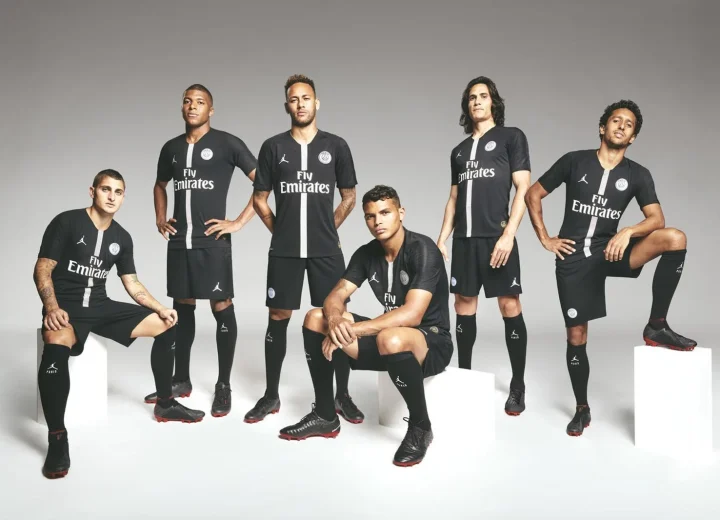
This essay opens our PSG hub because it makes the club’s cultural identity legible through one precise design decision. Next, the Jordan partnership changes the company a football shirt keeps, while the Astro Boy sculptures move the shirt onto a different kind of body.
Sources & image credits
Primary records for the dates, makers and projects discussed above. Photographs and artwork images are credited in their captions, with links to the original publication or portfolio.
Record checked 4 October 2026. Historical launch specifications are identified by date; product availability is not implied. The critical readings are BENI HASAN’s.