PSG × Jordan: a change of visual company.
The 2018 partnership put football and basketball in the same design conversation. Here is how to read that exchange.
A collaboration can change the surroundings of an object before it changes the object itself. A football shirt moves into a basketball-led visual world; a basketball symbol enters a football stadium. The interesting question is not simply which logo appears. It is what kinds of recognition the new arrangement asks a viewer to bring.
The documented starting point
Paris Saint-Germain announced its Jordan Brand partnership on 13 September 2018. The club described it as Jordan Brand’s first partnership with a football club, alongside its continuing relationship with Nike. Its launch account presented a collection extending beyond matchwear. This article concerns that historical launch, rather than the availability of any current product.
Two sporting memories
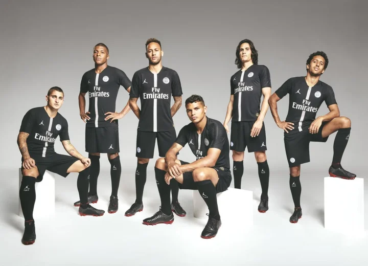
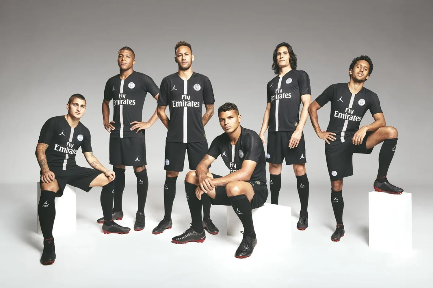
The 2018 launch photograph places PSG’s players together in black kits. Club badges and Jumpman marks occupy the same upper body, while the group remains unmistakably a football team. The exchange happens through that proximity: a basketball-associated sign is carried by footballers, making two sporting memories available within one garment.
That comparison gives us a way to look at clothing too. A badge can identify a club. A manufacturer’s symbol can connect an object to an entirely different sporting memory. A collaboration lets both operate at once. Neither requires the wearer to have attended the same match, watched the same player or encountered the garment in the same setting.
From uniform to wardrobe
The critical difference between matchwear and everyday clothing is the setting in which recognition takes place. On a field, a shirt helps distinguish a team. In a wardrobe, on a street or in a collection, it can be read beside objects from music, fashion and other sports. The context multiplies without erasing the original sporting reference.
It would be too easy to call that cultural crossover and stop. A more useful reading asks where the visual emphasis moves. Does the club badge still lead? Does a familiar mark make the garment legible to a different audience? Are colours carrying the connection, or is the collaboration chiefly communicated through typography and placement? These questions can be answered by looking at a specific object.
A method for the collection
Choose one item from the original official launch imagery, then describe it before judging it. Note the ground colour, the scale of each mark and the distance between them. Compare it with the Hechter stripe: one builds recognition through a repeated colour arrangement; the other places two established identities into proximity.
This is a reading of design, not a claim that a logo makes clothing an artwork. It also avoids turning the partnership into a resale story. For BENI HASAN, the lasting value is the new visual company football keeps, and the ways a sporting object can be understood outside its first arena.
Sources & image credits
Primary records for the dates, makers and projects discussed above. Photographs and artwork images are credited in their captions, with links to the original publication or portfolio.
Record checked 4 October 2026. Historical launch specifications are identified by date; product availability is not implied. The critical readings are BENI HASAN’s.